English Ales Brewery Web Redesign
English Ales Brewery brews traditional English Style Beers for the greater Monterey Bay. Established in 2000, they have been owned and operated by the Blackwell family. Headed by Peter and Rosemary Blackwell with their daughter, Karen, running most of the day-to-day responsibility.
They commissioned me to help with a redesign of their website. They wanted to bring their current website to a more modern and detailed approach and find unique ways to generate additional revenue for the brewery through the website. I was tasked with redesigning their Home Page, About Us, Featured Brews, Locations Page, and a new point-of-sale process.
Overview:
Look to revamp the website to an industry standard, while also looking for creative ways to generate additional revenue through the website by developing an E-Commerce location.
Problem:
My Roles:
UX Designer, Researcher, UX Writer
Figma
Miro
Google Docs
Google Slides
GoDaddy
Tools:
Stakeholder Interview Results
At the start of the project, I wanted to ensure I had a clear and accurate understanding of what the owners wanted to achieve with their redesign. I sat down and interviewed Peter, Rosemary & Karen to discuss the goals and focuses they wanted to gain from this redesign. Below I identified some of the goals, solutions and current pain points.
Increase traffic to the website and revenue conversion by 10%
Provide detailed and persuasive information on the Beers
Increase overall revenue from wholesale and new clients
Business Goal:
Create descriptive SEO as well as push marketing through social / share channels
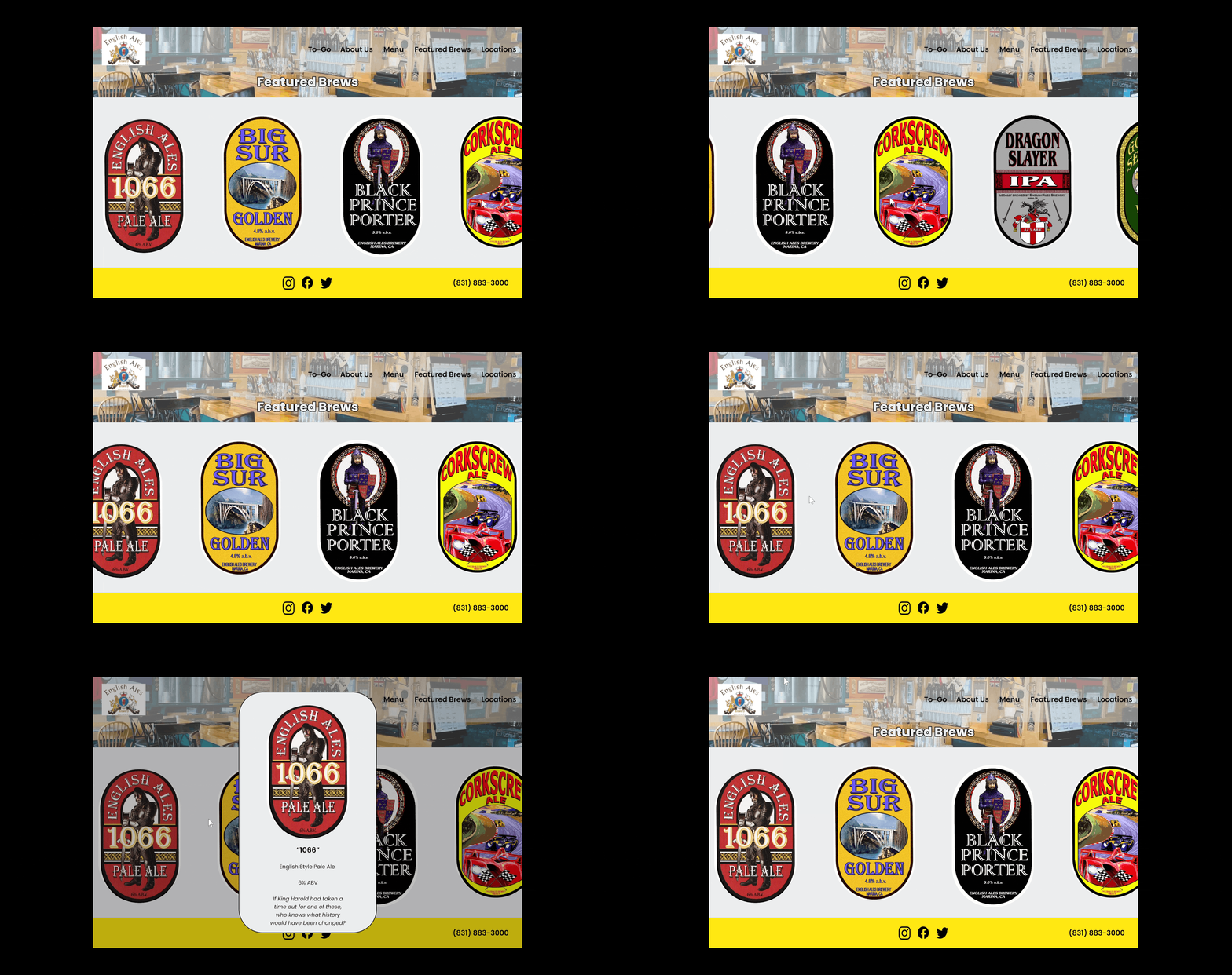
Controlled and focused overlay menu for each beer with descriptive terms such as ABV, style, and additional story information
Leverage additional components within the web portal to bring in new client inquiries and pick-up orders
Proposed Solutions:
Investing into the redesign could lead to needing a new site-building platform which would cost the brewery money
Professional shots of the Brewery are expensive but needed to showcase the true story
Creating a friendly platform to adjust information as needed would be good for future improvements
Developing a new point-of-sale system is challenging. Finding an appropriate platform to work the sales as well as providing users with detailed information on purchase
Stakeholder Pain Points:
UX Audit of Current Website
After speaking with the ownership group for the Website, I then wanted to take a deep dive and audit the current landscape of the website. Having been tasked to focus on certain areas, I spent most of my time on these three main pages before proceeding to other parts of the website.
Main Landing Page
The current large hero image does not accurately depict English Ales Brewery or its mission.
We aim to upgrade the image to provide an overview of the brewery and capture users' attention, encouraging them to learn more.
Insight: Look to identify one clear image that can showcase the story of English Ales Brewery and invites the user to browse the page further
Feature Brews Page
The Featured Brews section effectively uses large imagery to showcase the beer but lacks additional details and proper formatting.
We aim to upgrade this by providing organized and clickable detailed information, allowing users to learn more about each beer. An informed customer is a happy customer.
Insight: Identify a system within the website builder to create a more user-friendly experience when looking for information on the Beer.
About Us Page
The current About Us page fails to showcase the true story of the brewery, which is its ownership and patrons. Additionally, it features two free images instead of its own products.
We aim to showcase the true story and highlight all aspects of the brewery by using real images from the location to provide a more immersive experience.
Insight: Look to build a better story within the website that will truly show what the Brewery can offer to an individual.
Competitor Analysis
After analyzing the current state of the web page and speaking with the ownership group, it was time to dive into some research and see what companies are currently doing well and what we can do to improve upon. Insights were listed based on my research. My main focus was finding similar size & scale breweries within the Bay Area. I focused my efforts on researching the same feature points that the Blackwell family was having me redesign and add.
Main Landing Page
Large clear Hero Image that showcases it is a brewery
Doesn’t display the look or feel of what the brewery is like culture wise
Clean header and navigation tools
Insight: Finding a clear hero image that showcases the brewery’s atmosphere will paint a better picture of them.
Featured Brews Information
A clear list of available and rotating beers
Descriptive information which includes ABV, Style, and Cost
Could add imaging for a more visual approach
Insight: Make sure we can list all beers and provide details with images so users can make a more informed selective decision.
About Us Page
The picture painted of who they are through photos and text
Particular emphasis on keywords and focal points
Showcases positive moods of individuals working within the brewery
Insight: The story should be focused on quick facts about the brewery that clearly paint a picture of who they are, but without overbearing them with type.
Point of Sale
Clear pick-up and ready window for purchases
Updated Cart information to show users exactly what they are purchasing
Strong color coordination to showcase exactly what we are selecting
Insight: Need to make a clear indication of when a user is purchasing a product and allow them to know exactly when they will be able to pick up the product
Application of Research to Design
Following the initial research phase, I wanted to focus my redesign on creating a smoother story for English Ales to tell through their website. I created a wireframe and sent out an early prototype test to the Blackwell family for layout approval.
After initial approval of the wireframe, it was now time to work on the hi-fi mock-up. I wanted to make sure that as the process was finishing up I would be able to send out to the Blackwell family for another test, as well as some of their local patrons to get feedback on the layout and feel.
NEW Main Landing Page
The new focus was to allow the user the opportunity to get a feel of what English Ales is as a Brewery. We learned right away that it is bright, has multiple locations, multiple brews, and is a family-run business. We want to guide the users first to the locations, then learn about the beer, and lastly the story of the brewery itself.
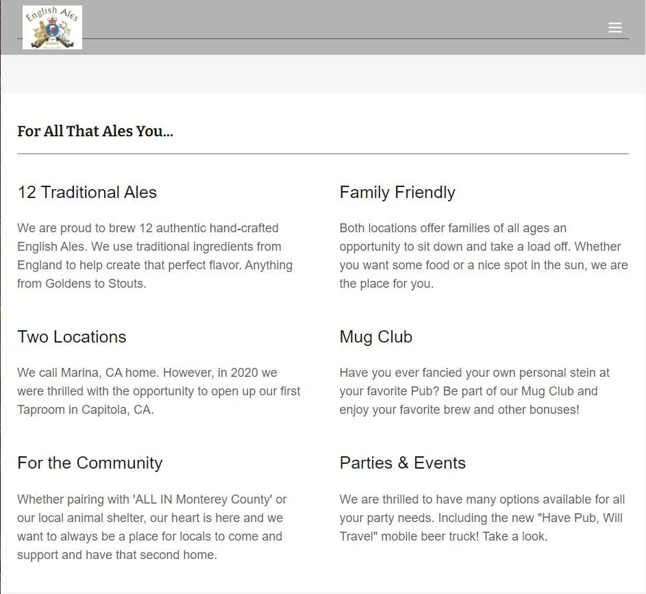
Due to the nature of the web portal, the final design included a quick fact guide for users as opposed to the proposed buttons. I designed the fact sheet for the Brewery.
NEW Location Page
The location page provides the necessary details that you would come to find in regard to any restaurant. Along with detailed information, I added vibrant photos of each location to better connect the details.
During the implementation process, I was able to design this page onto the main home page. Using a fairly similar breakdown to that of my final mock-up.
NEW Featured Brew Page
I designed an interactive side scroller to allow the User to click on a specific beer to learn more.
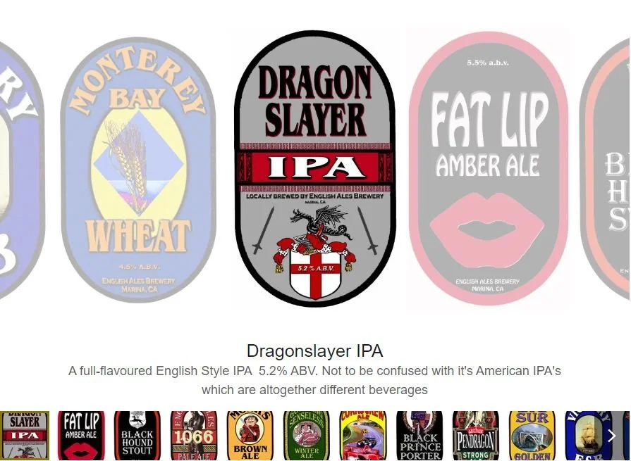
The final design is also a side-scrolling system. However, the information is listed below versus a clickable approach. This was due to the website development platform.
NEW Parties & Events
In place of creating a point-of-sale page, I designed a Parties & Events page that will help drive revenue for English Ales.
The primary focus is on their new beer trailer, “Have Pub, Will Travel”. English Ales has always done outside events, however, they did not have a specific page to showcase what they do.
Previous notifications about the product were done by word of mouth or social media.
NEW To-Go Page
I created a new online ordering page with options for in-brewery pickup, detailed selection screens, and a confirmation page with the order numbers to provide a seamless purchasing experience for customers and increase sales for English Ales Brewery.
This achieved the goal of increasing online conversion while minimizing employee sales time.
Due to the nature of the breweries’ current standing, they are holding off on implementation of this, but are looking to move forward with it in the future.
Lessons Learned & Results
Increased Traffic
Increase of views up to 3000+ unique visitors per month. Engagement on the website increased from 70 to 89 based on GoDaddy Metrics.
Content Design
My emphasis was on the consistency of language used throughout the product, enabling users to understand what they were selecting quickly. This was reflected in the information displayed on the page and the Point of Sale screens.
New Point of Sale Page
I created a new product page for the website to enable customers to purchase and pick up items such as apparel, beer, and kegs, filling a gap identified through competitive research.
Good Designs. Limited Application
Some of the designs were good ideas, but due to the web portal that the site was hosted on, we weren’t able to adjust all aspects of the redesign. It would be nice to build from scratch.


